Energizing Spaces
The Emotional Power of Color In Commercial Design
Here at Momentum, our team has been delving into the transformative impact of color in our designs, focusing on its ability to transform interior environments and evoke specific emotions. As the great French artist Henri Matisse wisely noted, "A certain blue enters your soul. A certain red has an effect on your blood pressure. A certain color makes you feel in a certain way. Color is vibration like music; everything is vibration."
With a diverse palette, our Spring/Summer 2024 collections embody this idea of color breathing spirit and life into spaces—from Yinka Ilori's vibrant brights and Mix Collage's textured blends to the serene neutral creams of our new Symphony collection, and many others in between. We've been reflecting on how color creates emotionally engaging environments that shape our moods, feelings, and energy levels.
Inspired by our "Color You Can Feel" campaign and the vibrant Chicago NeoCon showroom renovation, our Yinka Ilori x Momentum collection has beautifully demonstrated the profound power of color. From the richest, boldest hues to the softest pastels and grounding neutrals, we believe color is crucial in creating commercial spaces that deeply connect with people's emotions.
Grasping the principles of color psychology in interior design helps us understand how different hues can affect emotions and define the atmosphere of a space. Let’s explore how particular color groups impact the feelings and actions of those who enter.
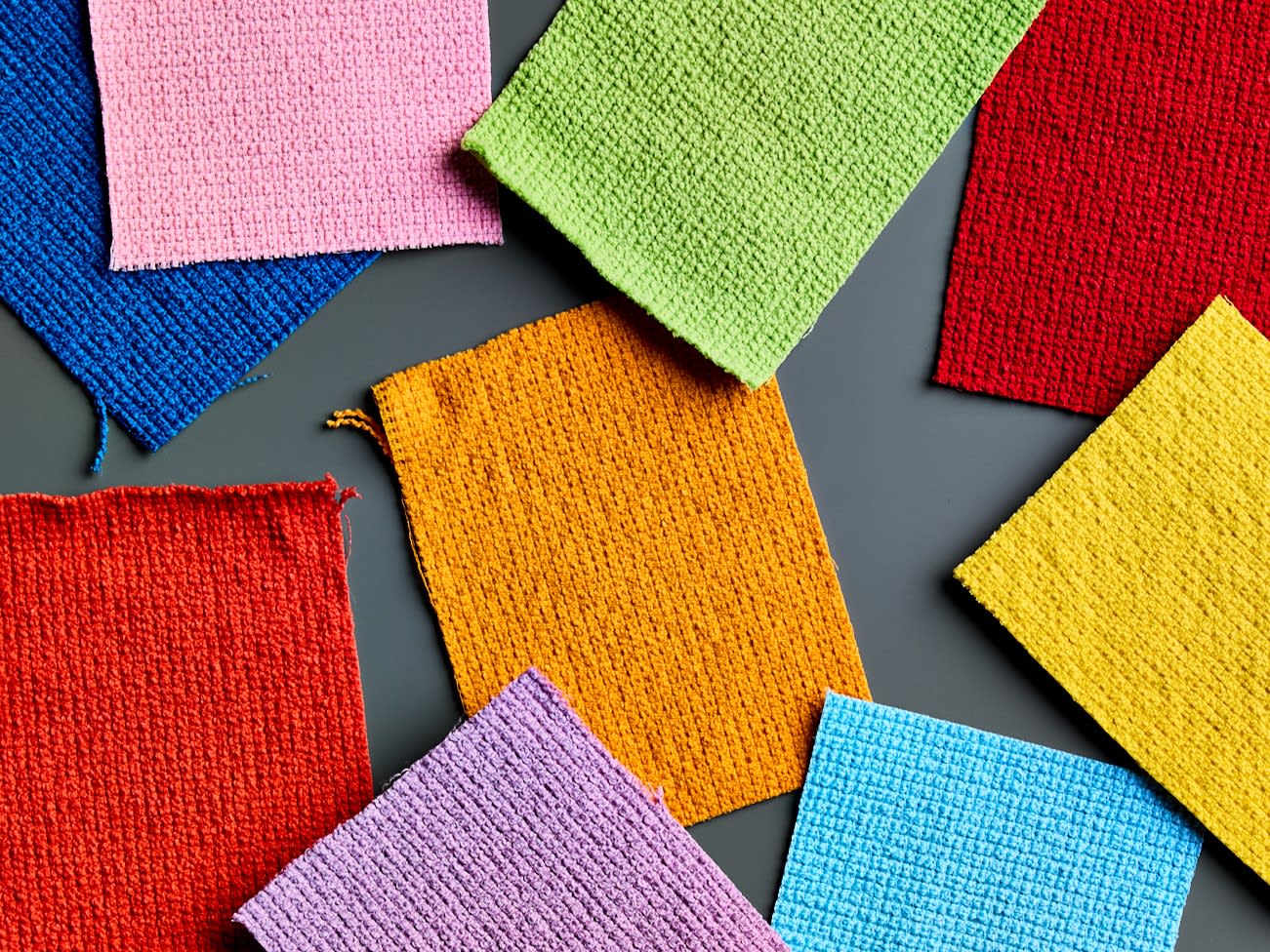
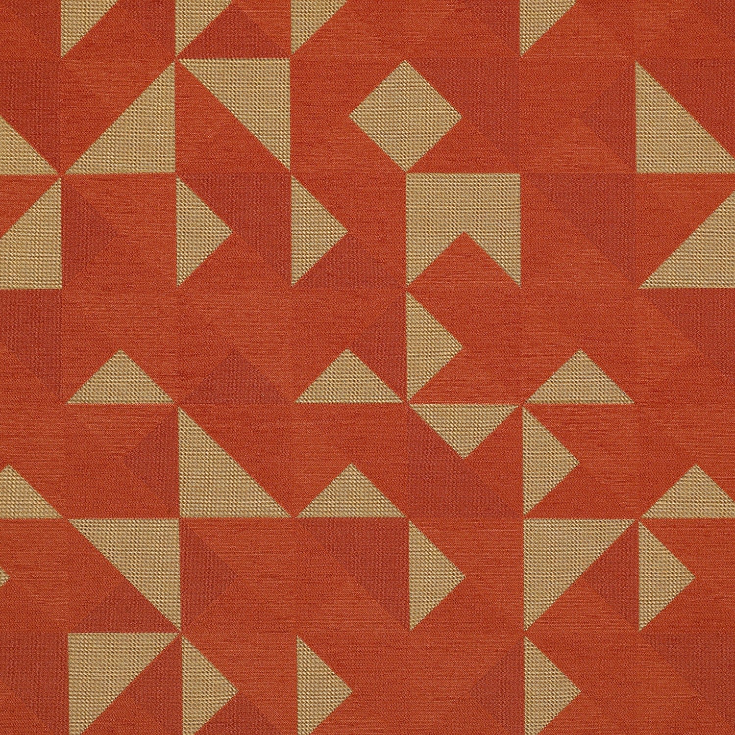
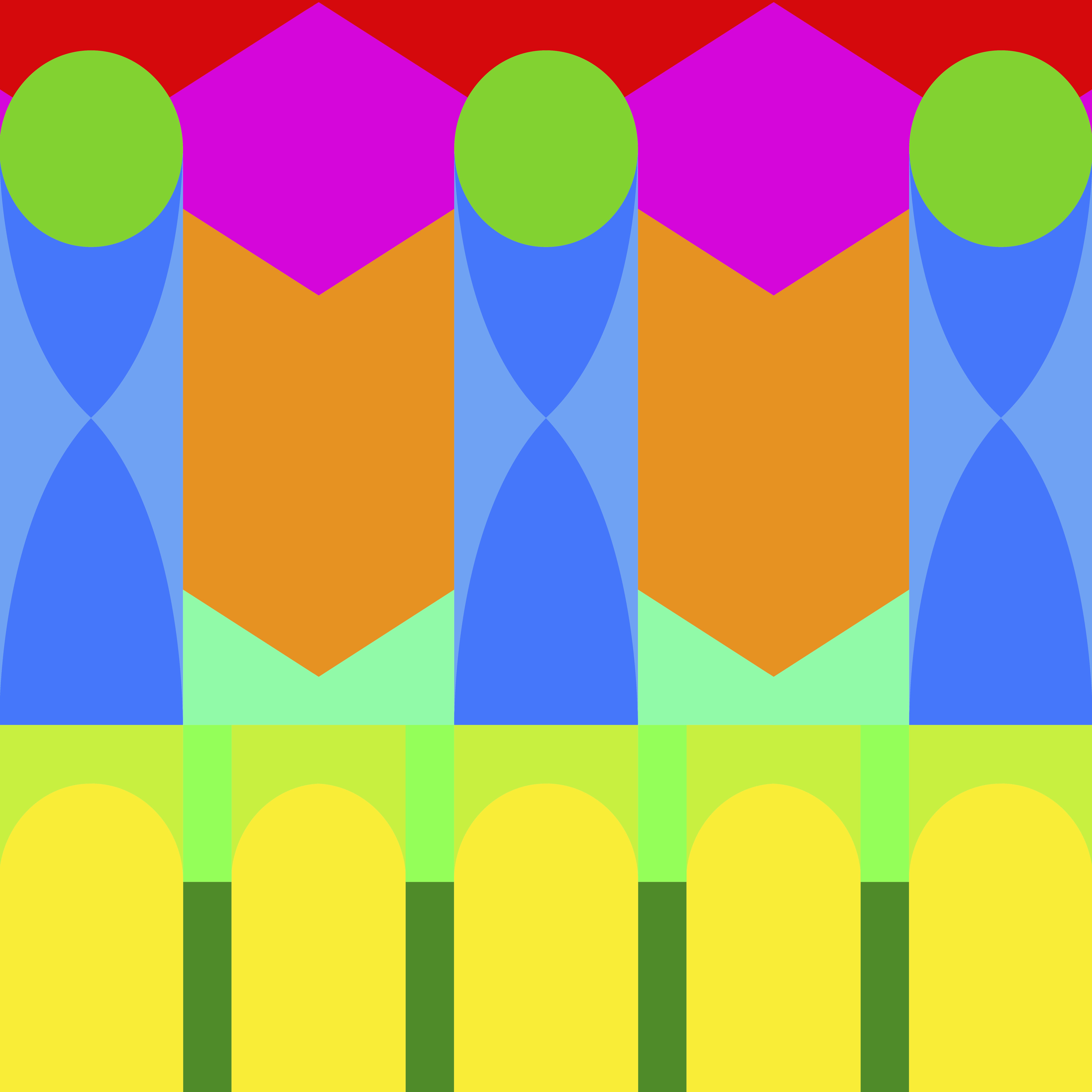
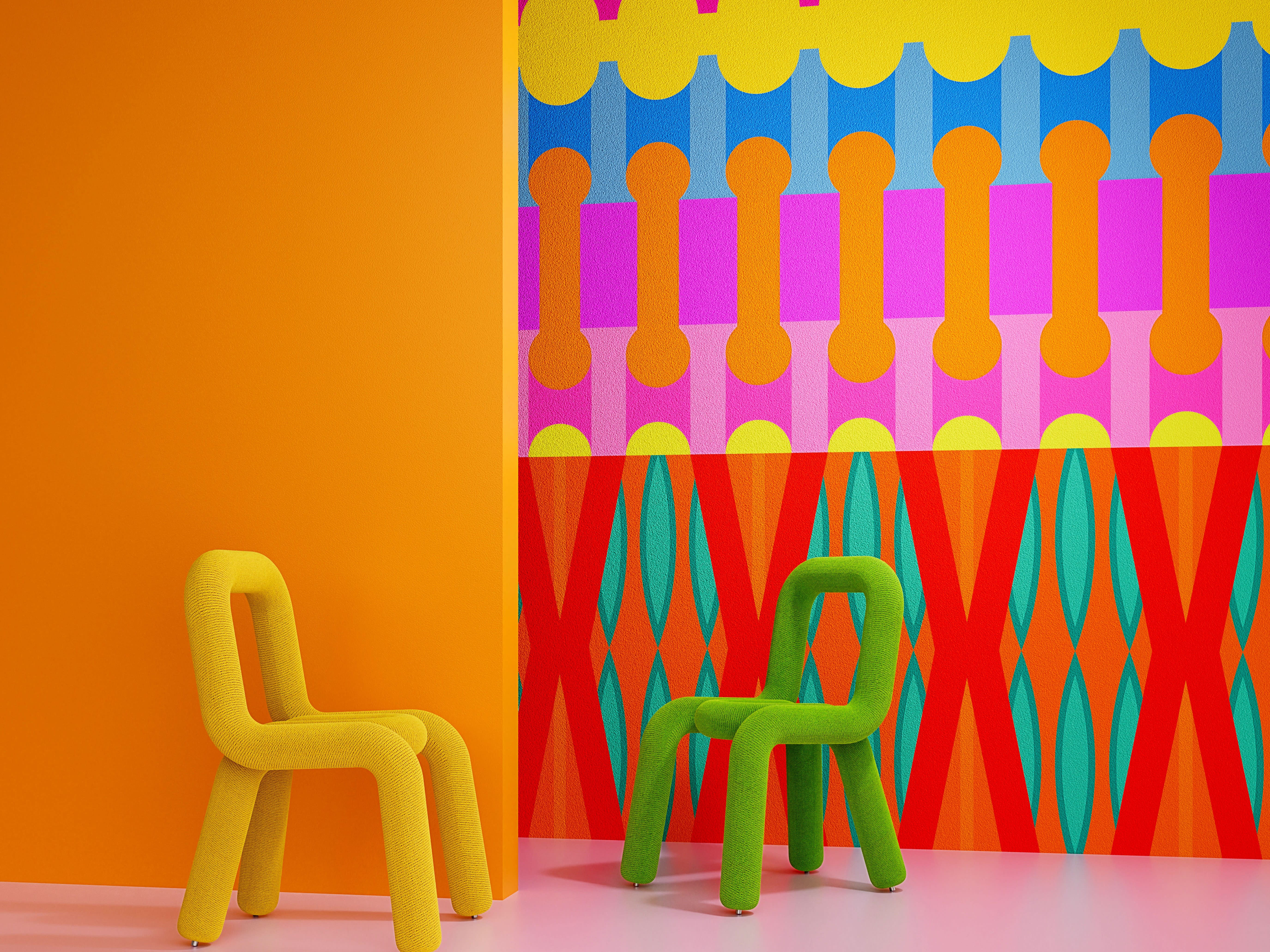
Feel Radiant: The Warm Colors of Reds, Oranges, & Yellows
Carousel
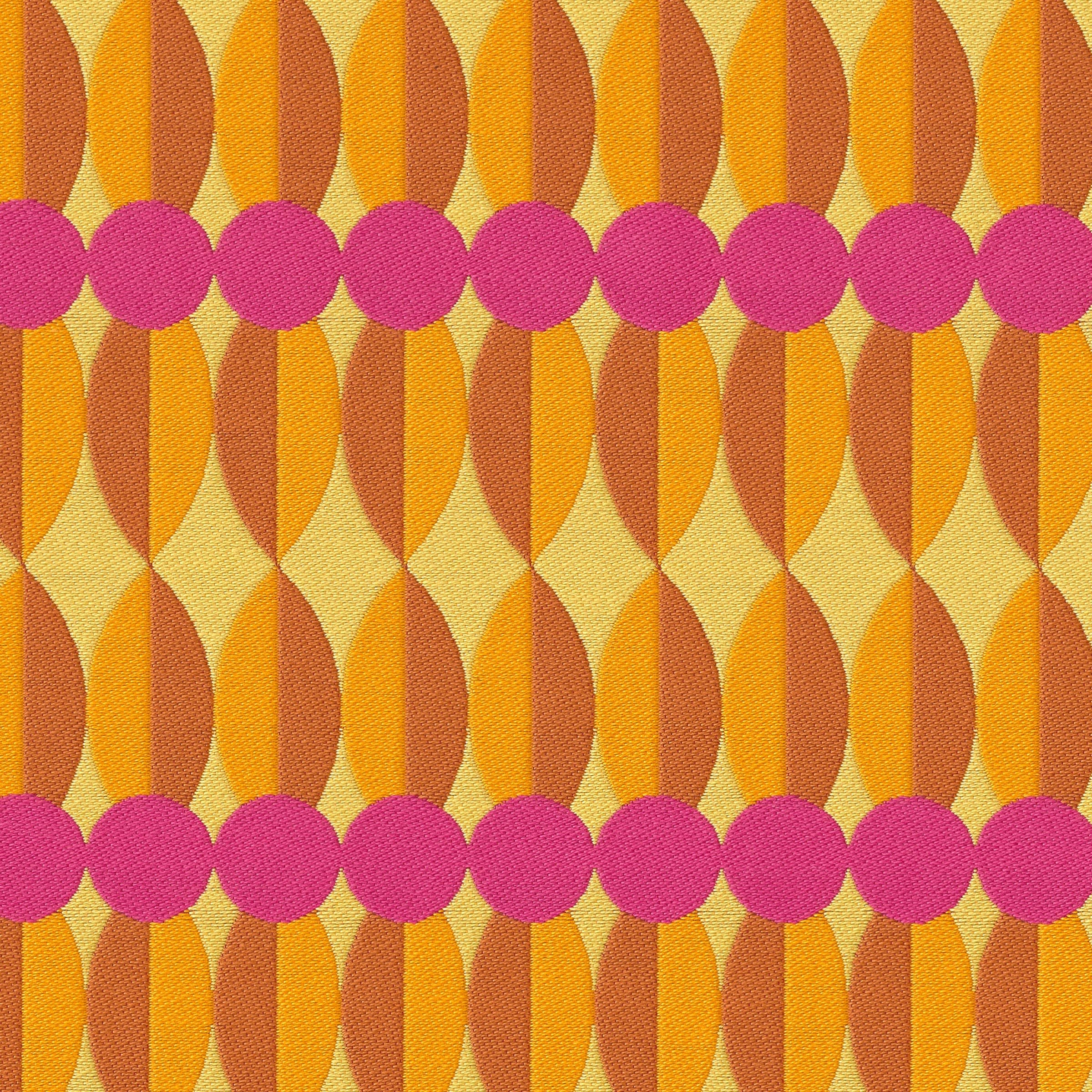
Warm colors, from the gentle glow of a sunbeam to the intensity of a blazing fire, naturally energize spaces and invite social interaction; they infuse interiors with life.
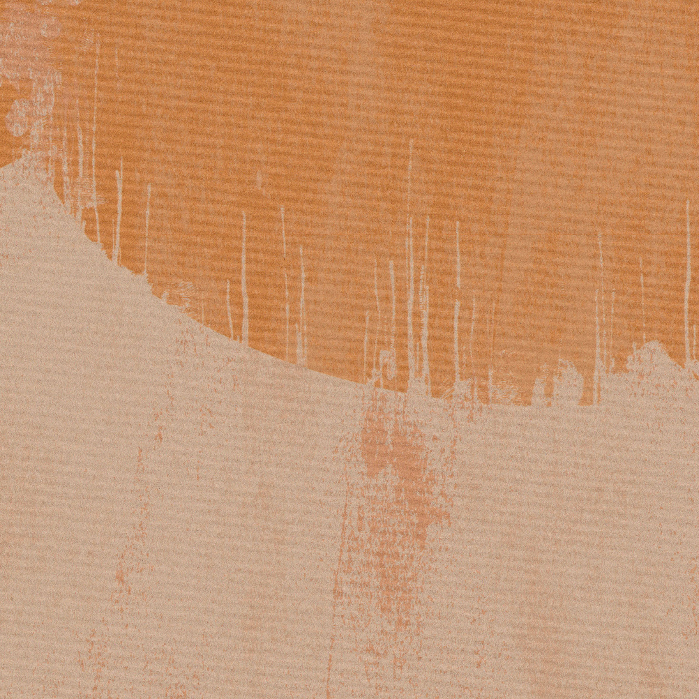
Red, with its bold and passionate undertones, injects spaces with vibrancy, making it ideal for creating focal points that stimulate activity without overwhelming. Orange offers a playful warmth, fostering a sense of creativity and connection in communal areas. Yellow, reminiscent of sunshine, brightens spaces with a sense of optimism and cheer, especially in areas with limited natural light. Together and apart, these warm hues transform interiors into dynamic, engaging environments that promote interaction and positivity.
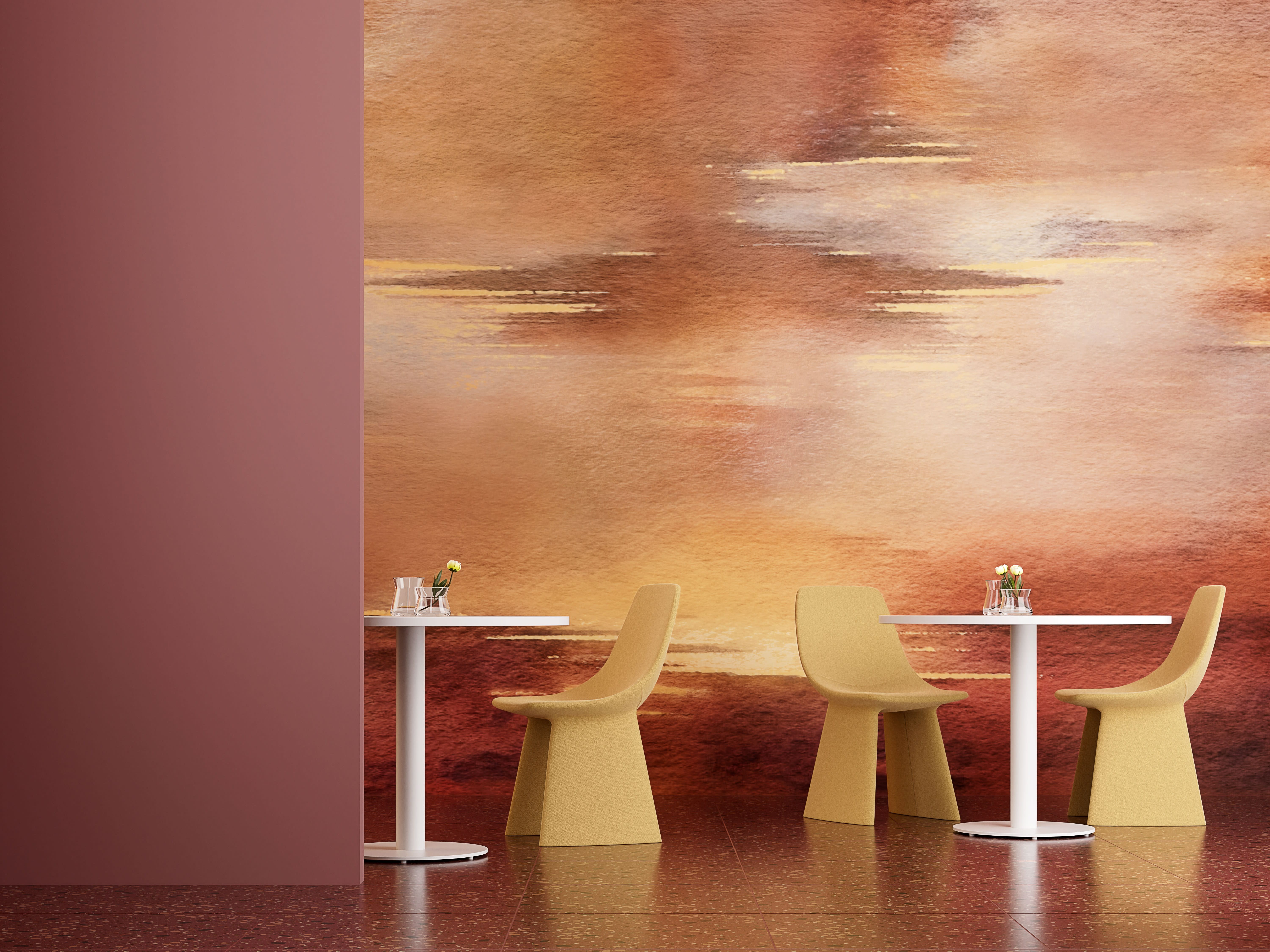
Take this dining area (left) as an example. A part of our Studio Designs from the Digital Creations wallcovering line, the pattern Soleil captures the essence of a vibrant Tuscan horizon, infusing the space with energy and radiance that is both bold and grounded.
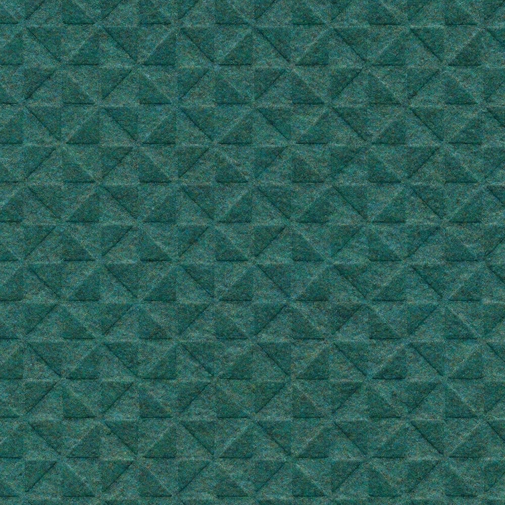
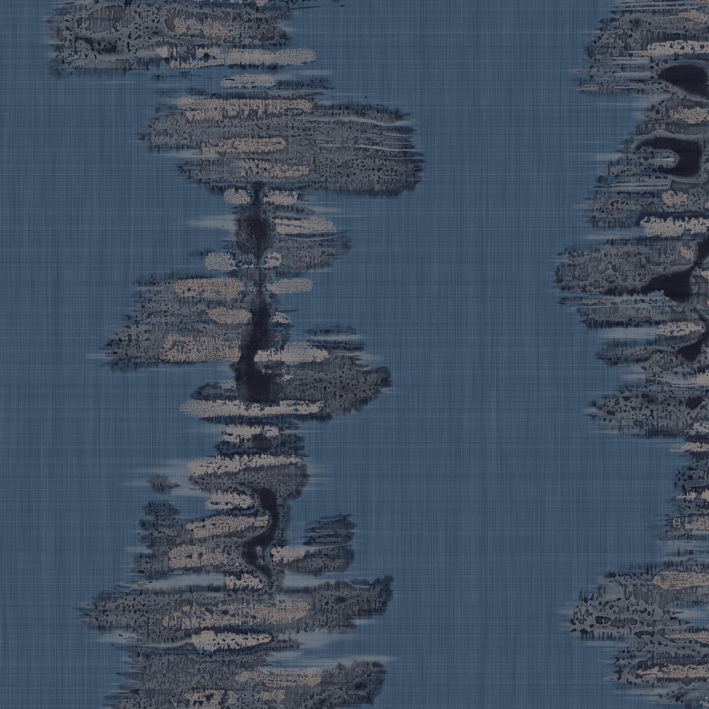
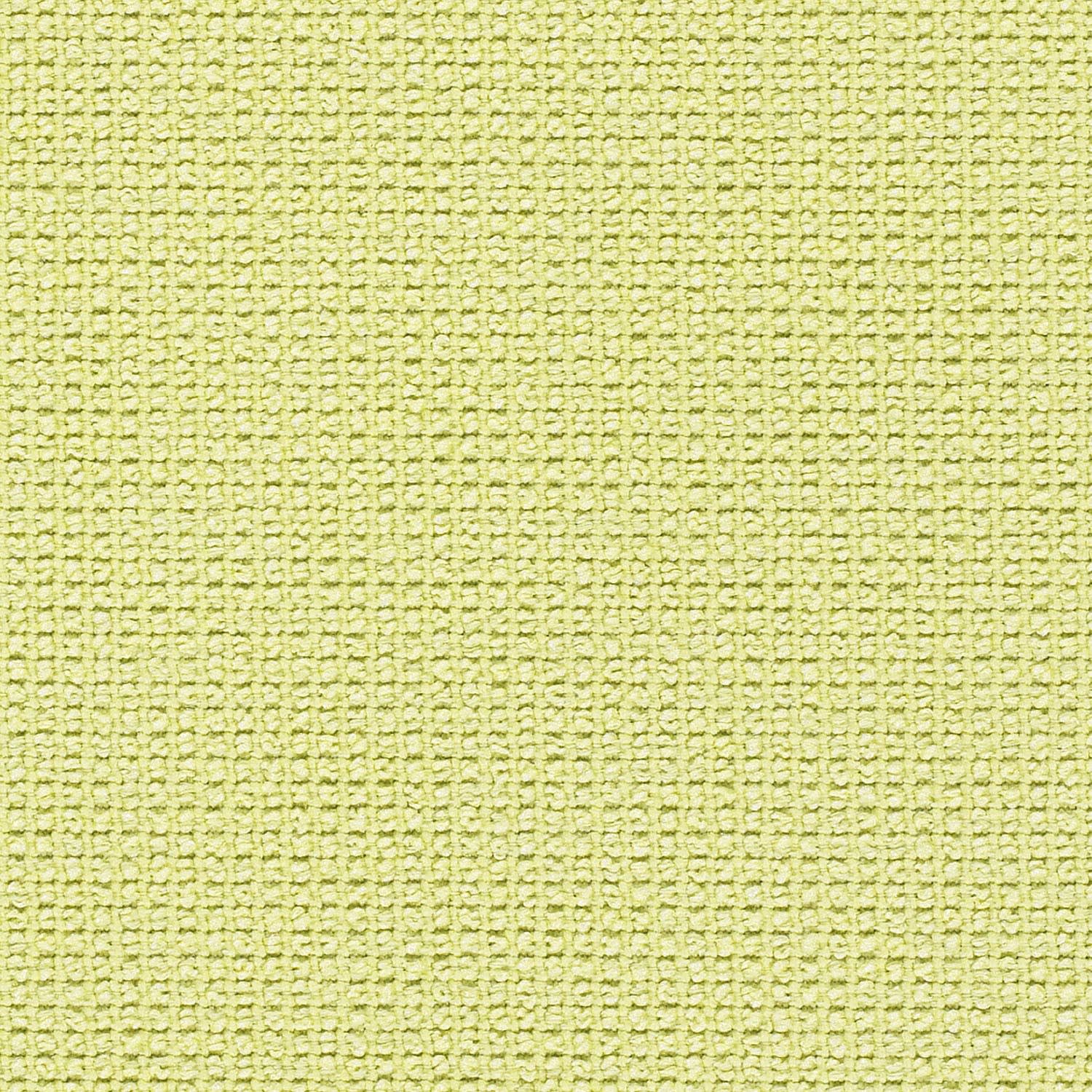
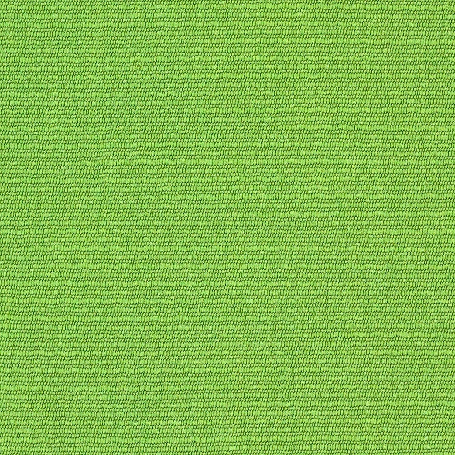
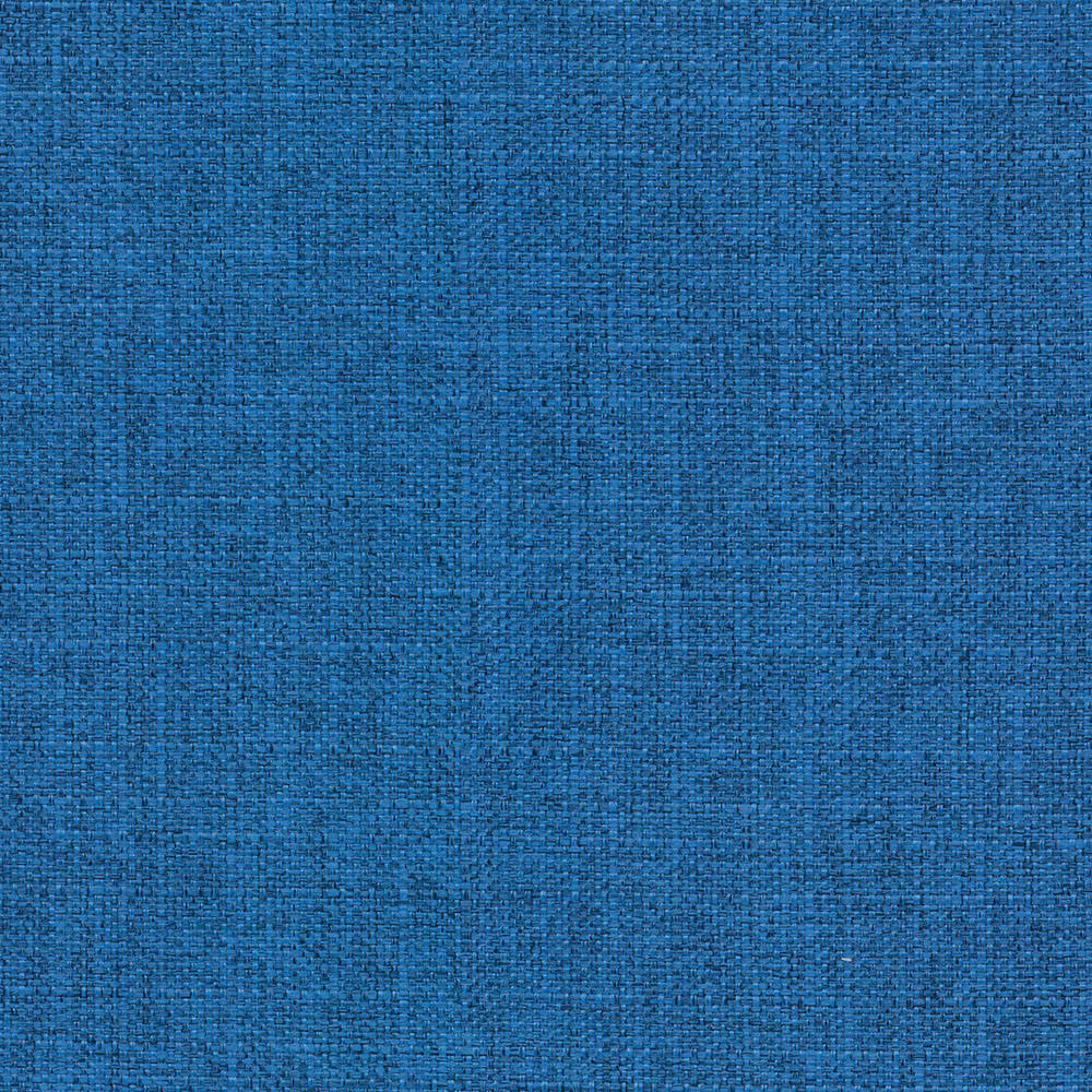
Feel Refreshed: The Cool Colors of Greens, Blues, & Purples
Carousel
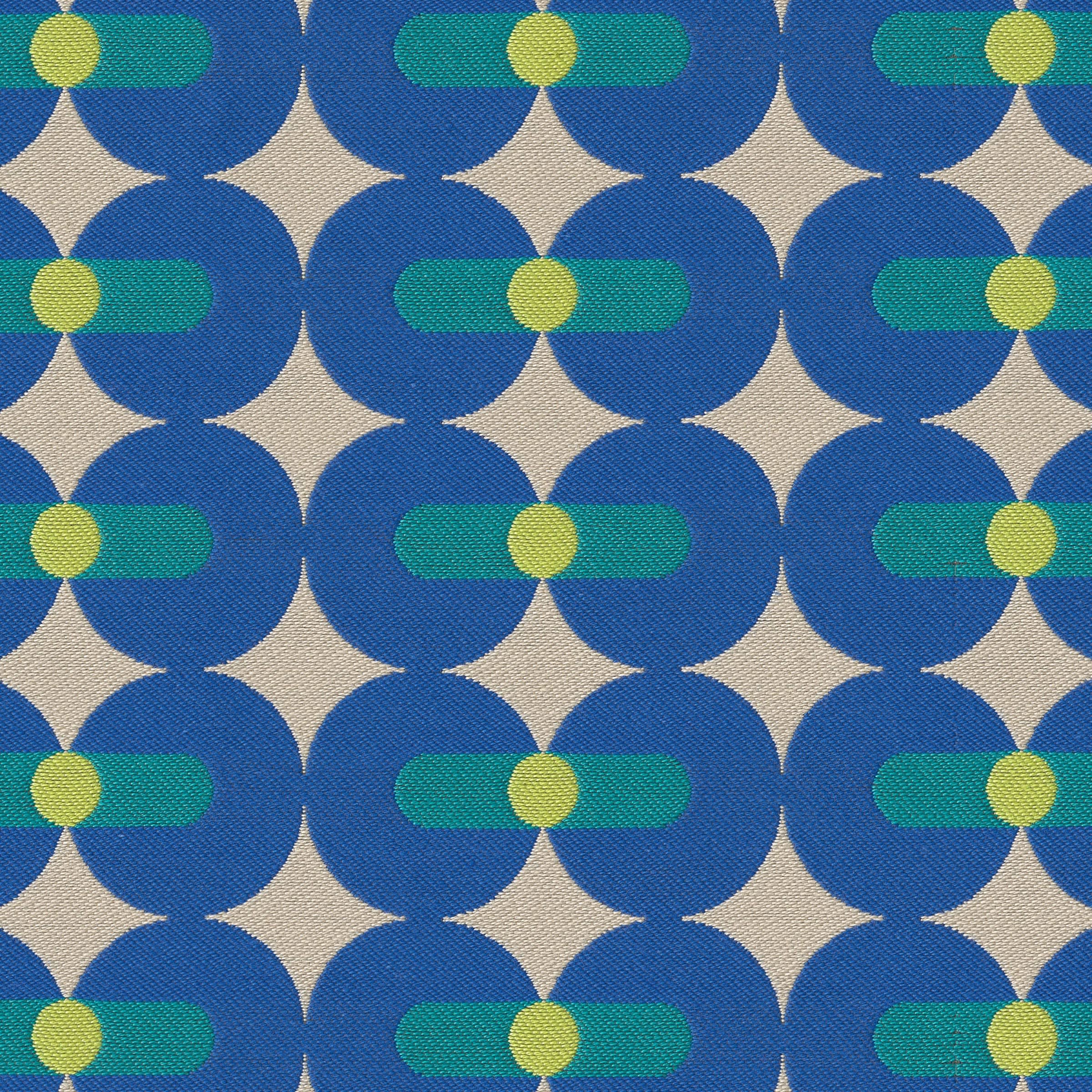
Like bringing the outdoors in, cool colors inspired by nature offer a sense of calming relaxation and rejuvenation in commercial spaces.
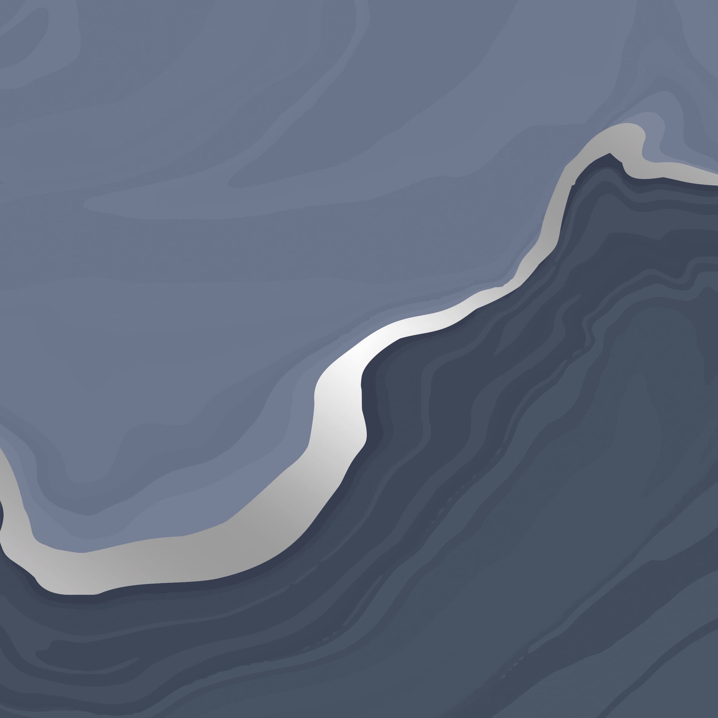
Blue, reminiscent of serene skies and calming waters, is perfect for spaces like spas and wellness centers to craft a soothing aura. Green tones from moss to acid (all trending as #getyourgreens across many industries, per WGSN) symbolizes growth and renewal, making it ideal for healthcare settings that want to move away from a sterile, gray look in favor of a fresher, nurturing atmosphere. Soft purples introduce a gentle, meditative-like ambiance, enhancing areas where peacefulness is key.
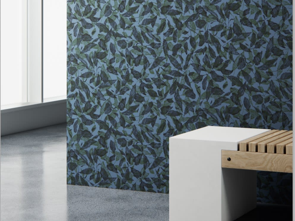
Take the rolling ocean blues of NuFelt Mystic Pathway rolled acoustic (above left), for instance—the scheme instantly refreshes and renews a waiting room or lounge. Or consider Laurel Leaf wallcovering (right) where foliage greens and a hypnotic indigo backdrop create a calming, outdoor nature-inspired space that invites visitors to unwind.
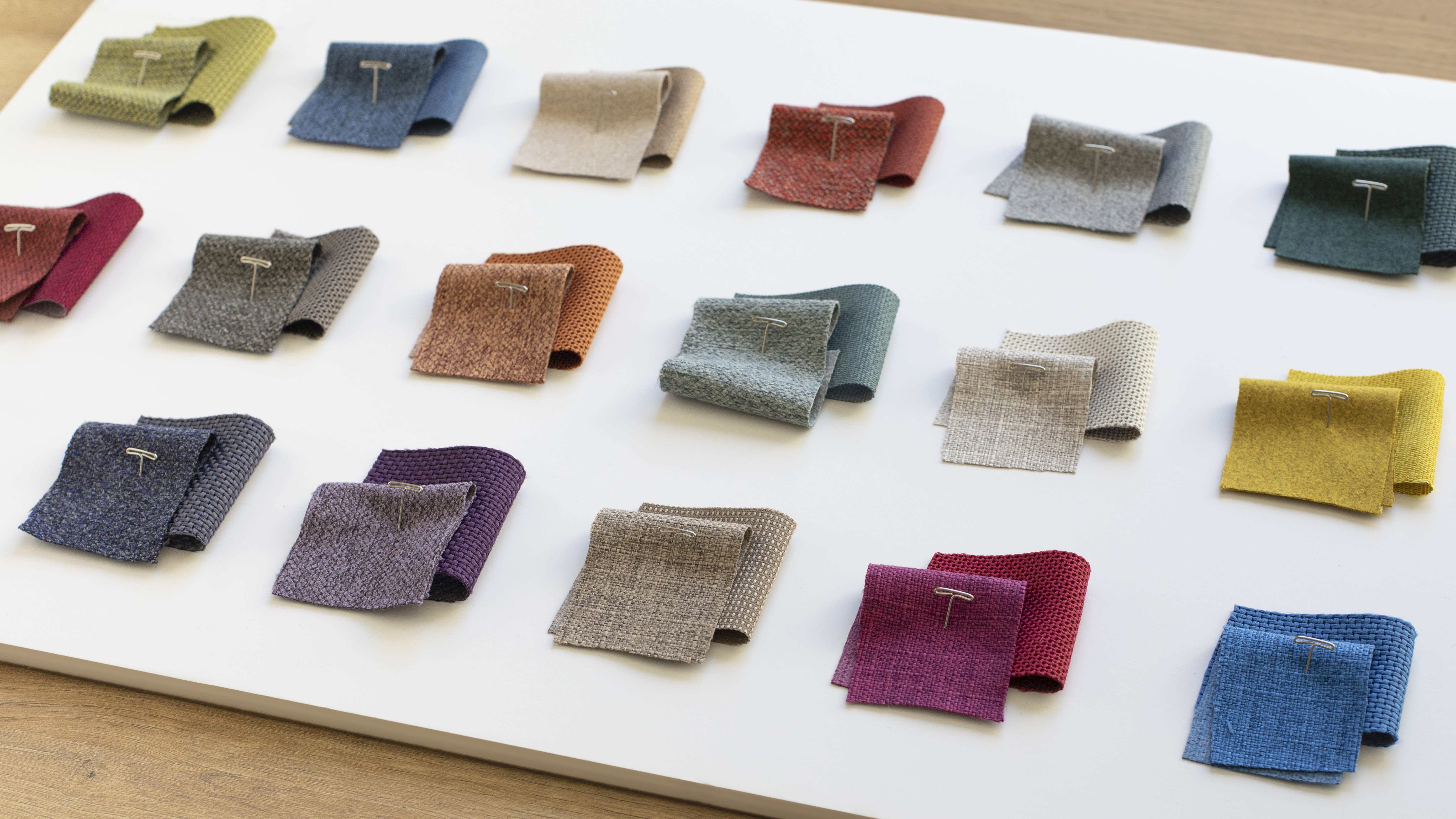
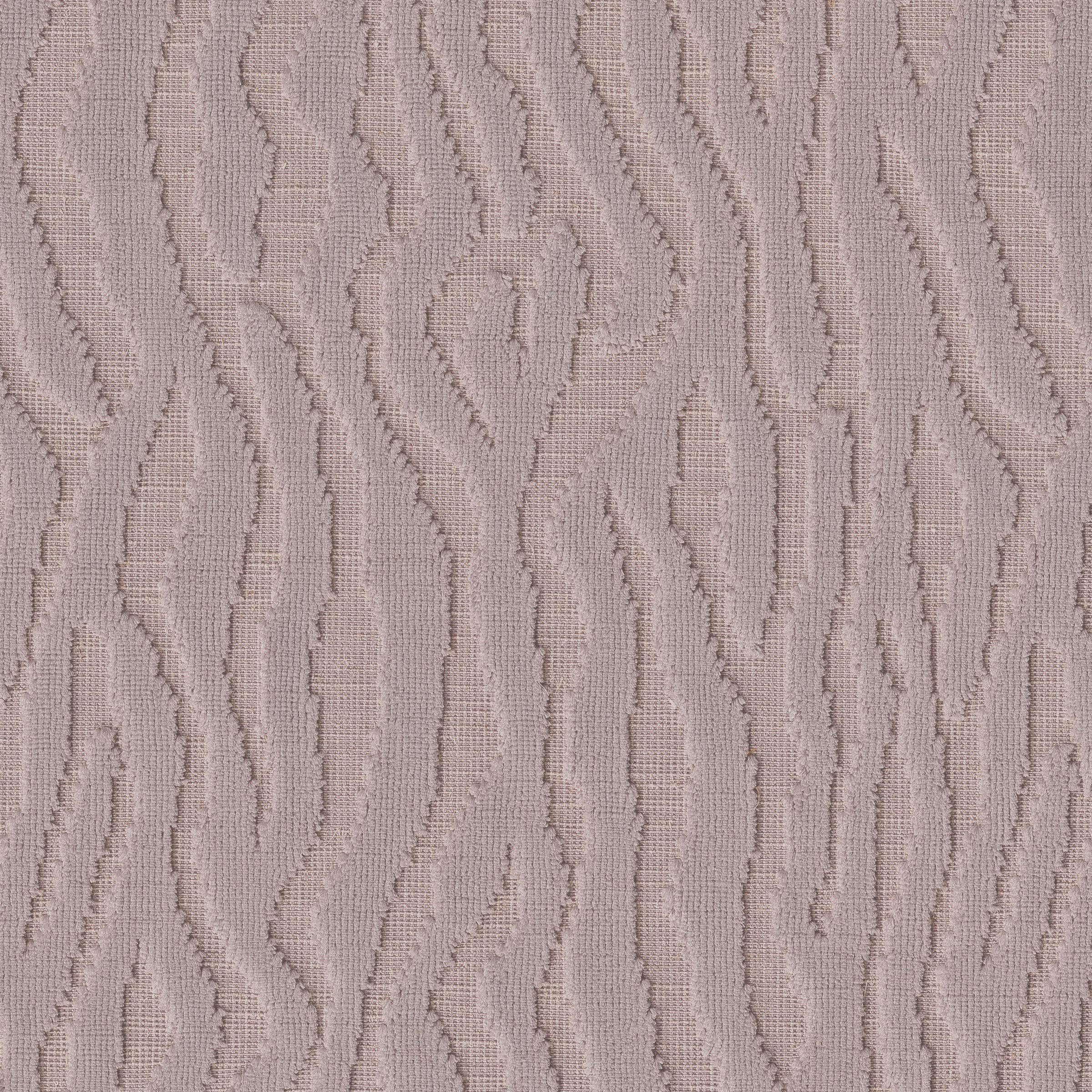
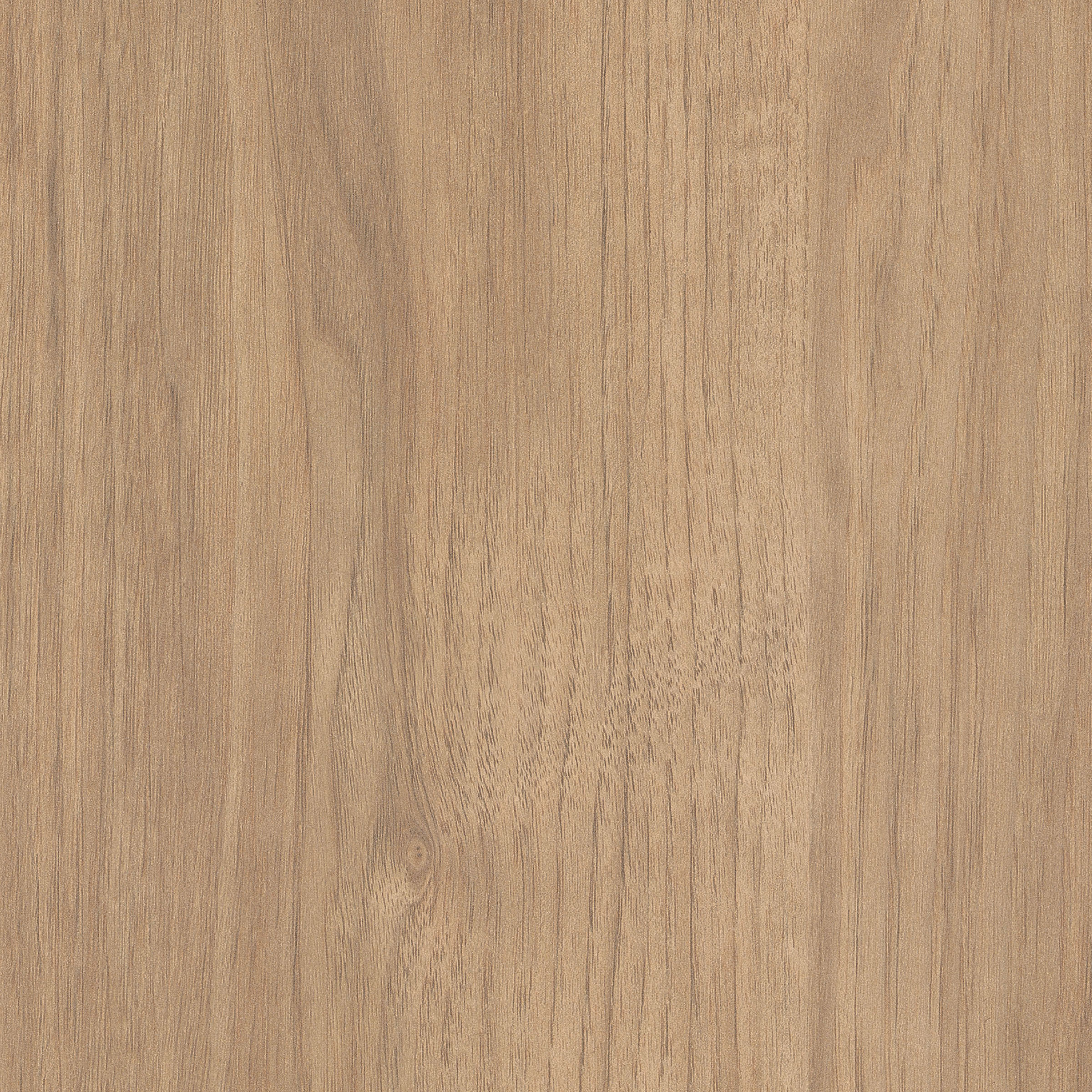
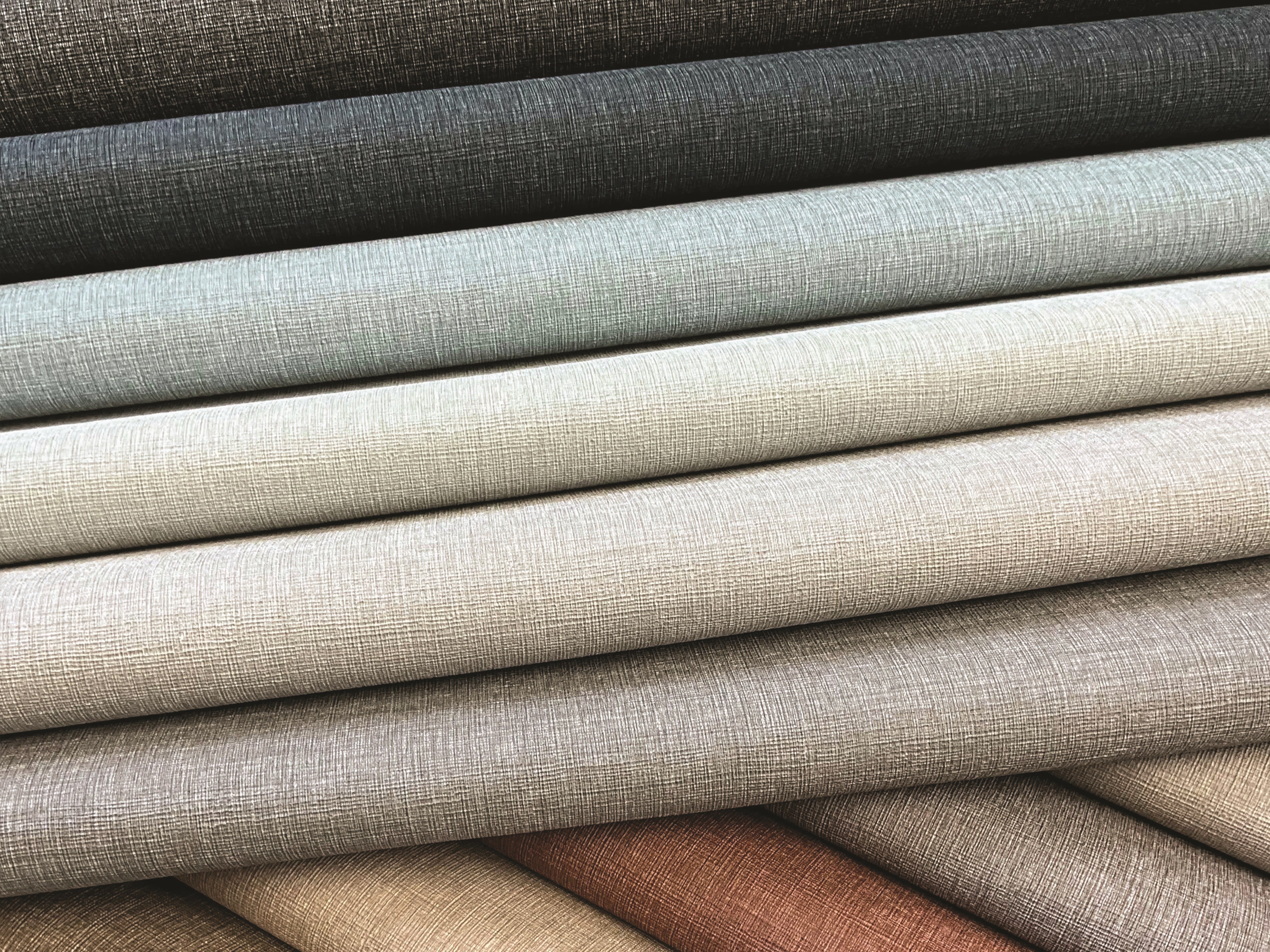
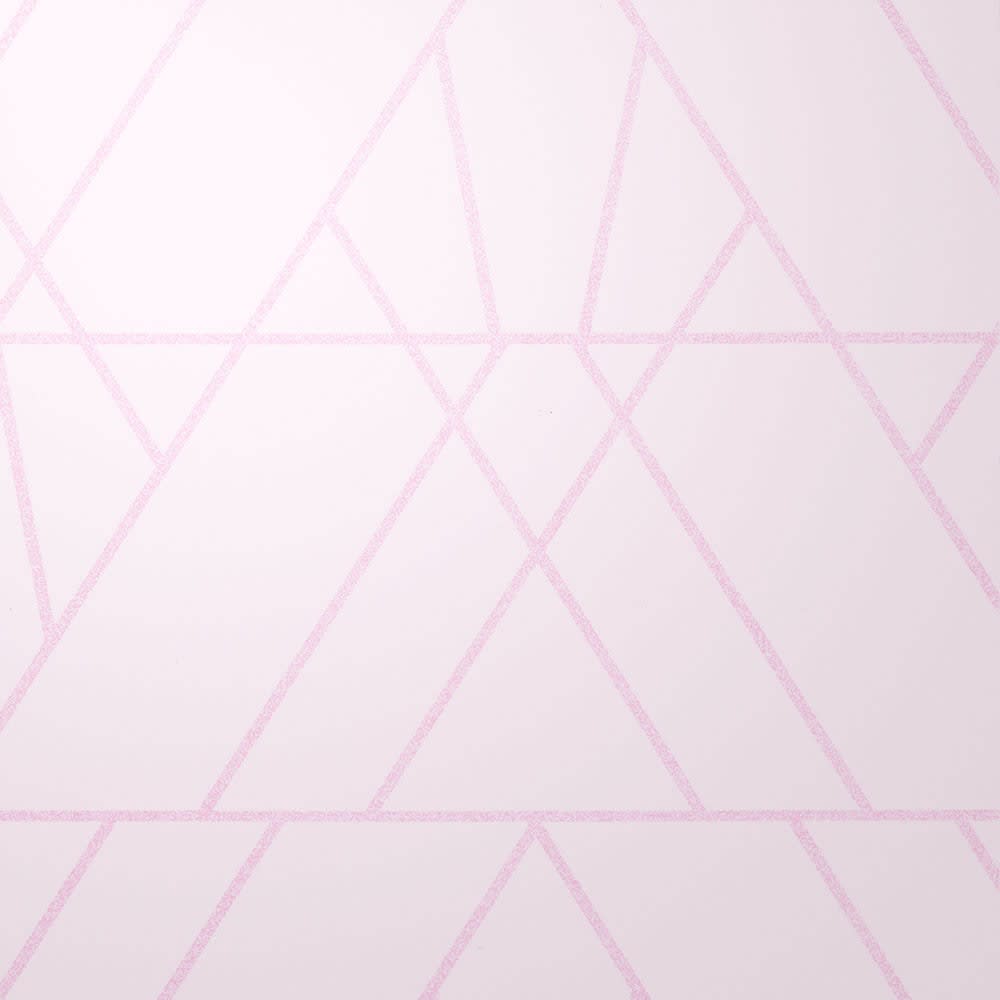
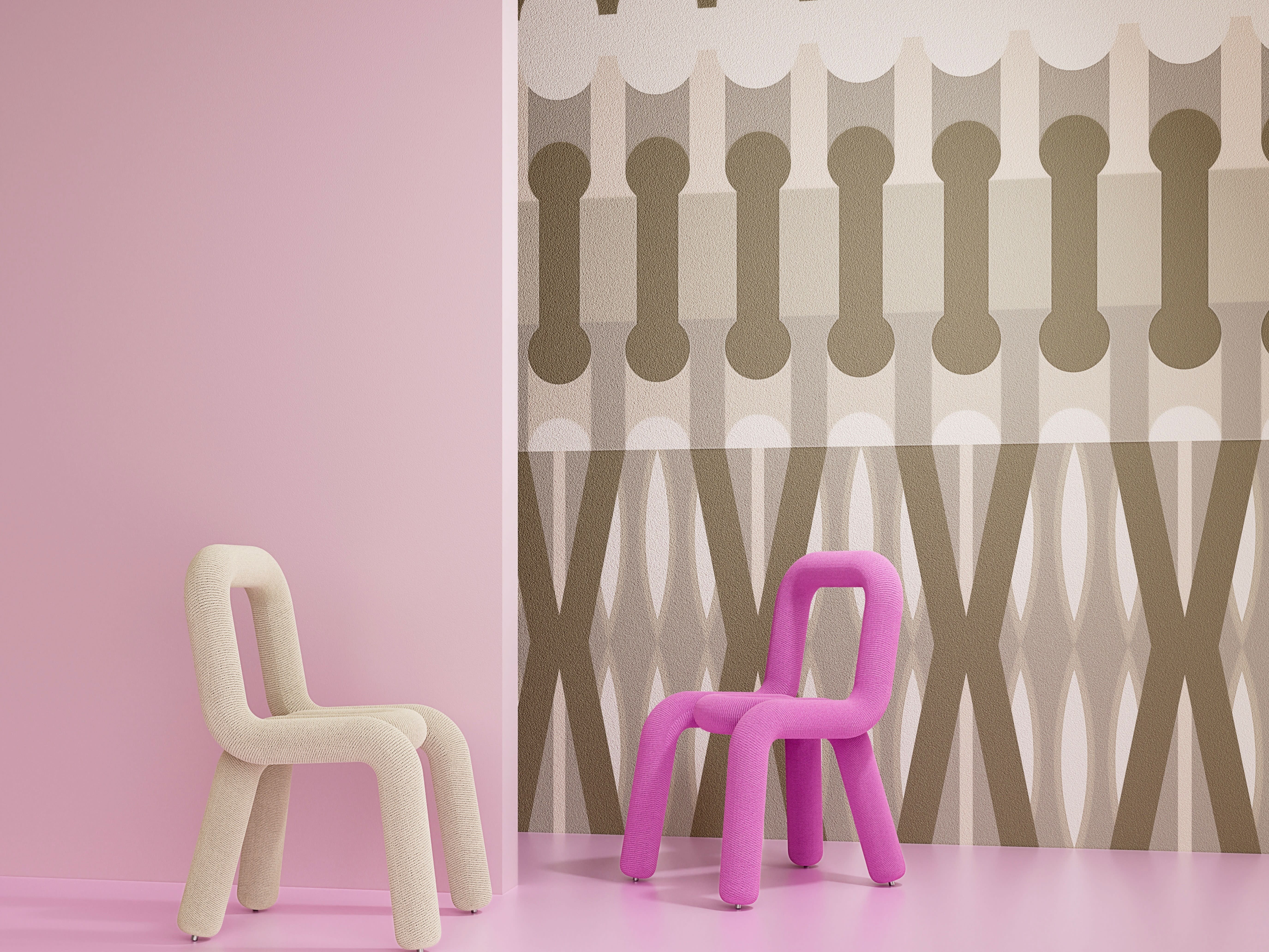
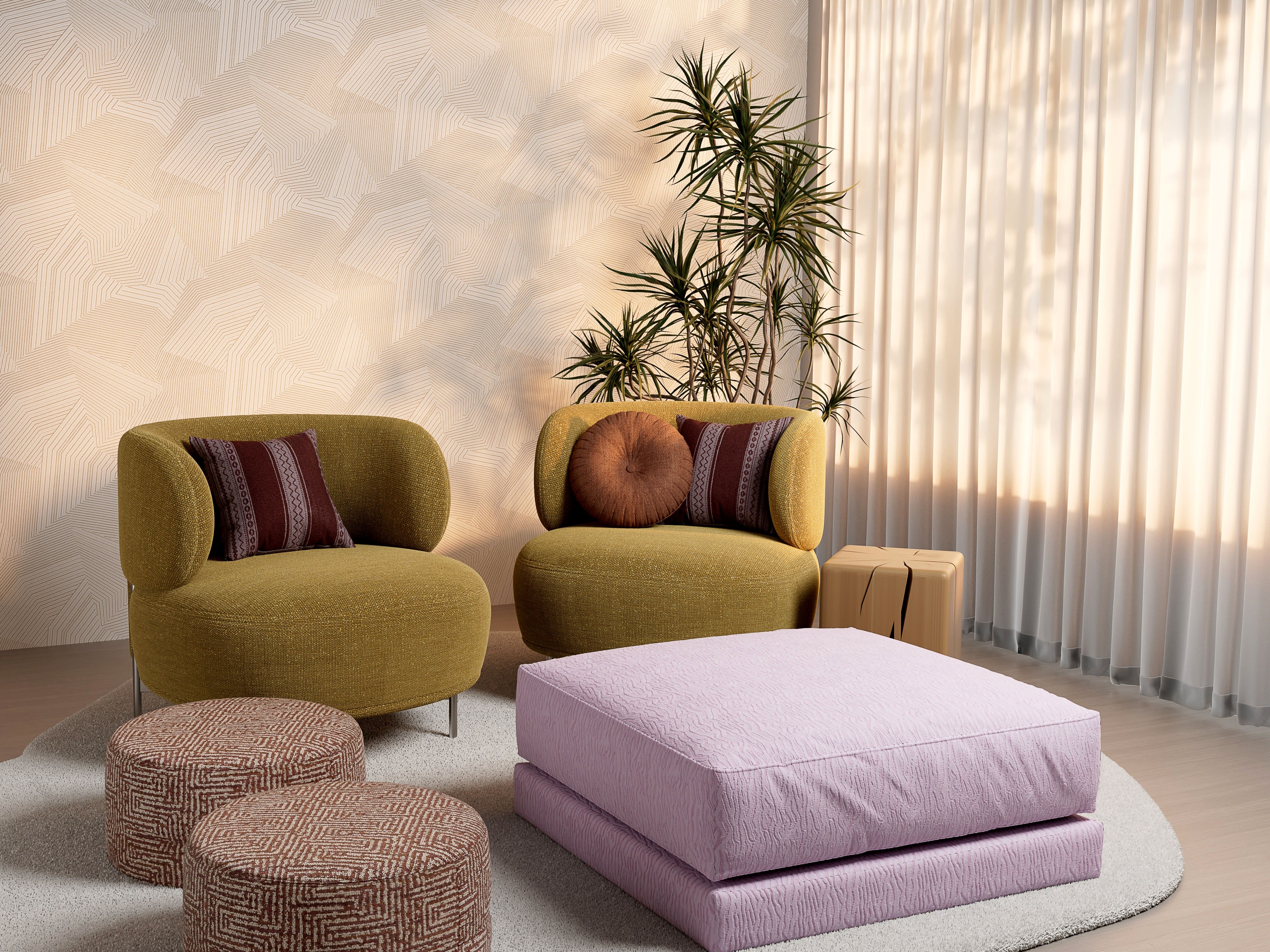
Feel Balanced: The Neutral Colors of Beiges, Browns, Grays, Creams, & Whites
Carousel
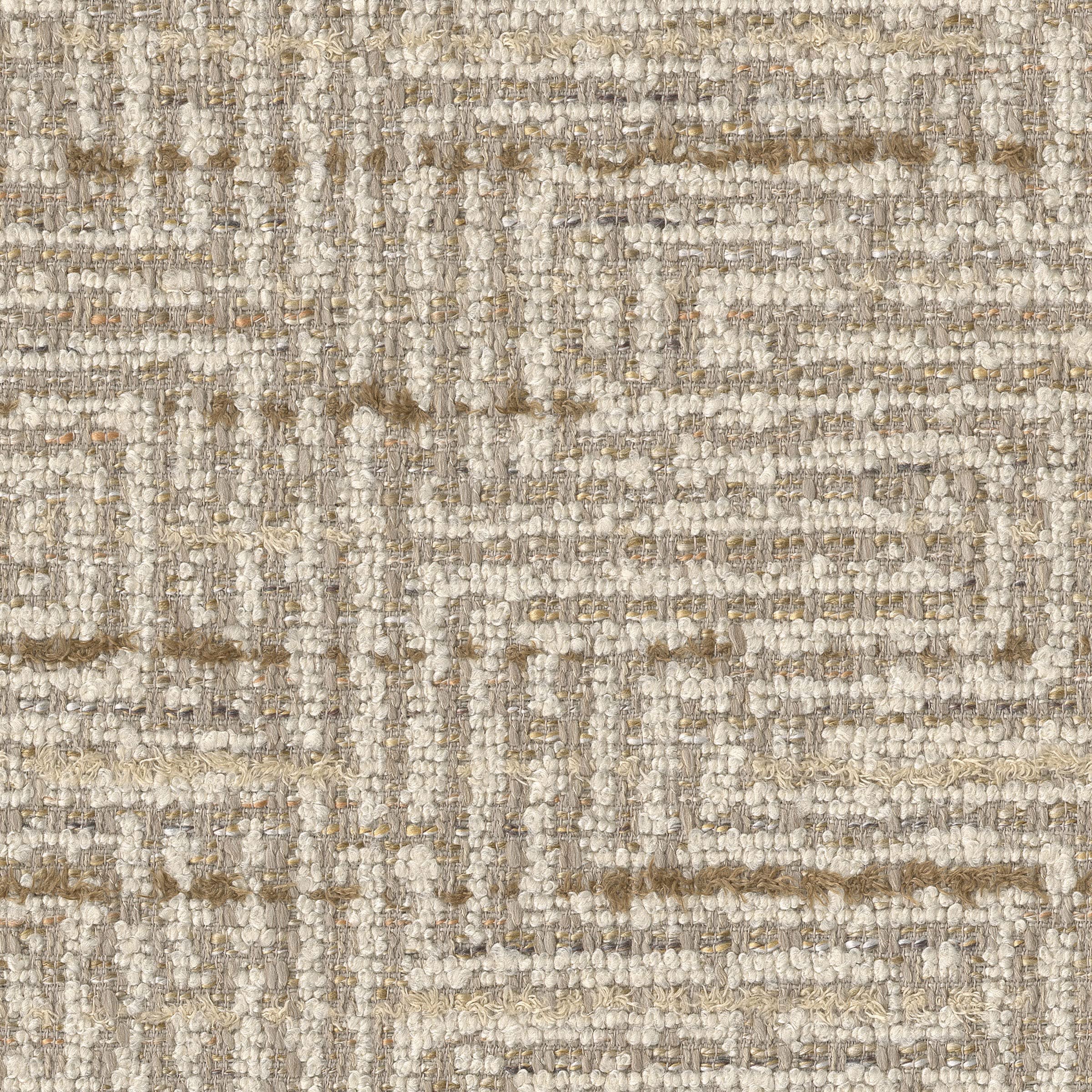

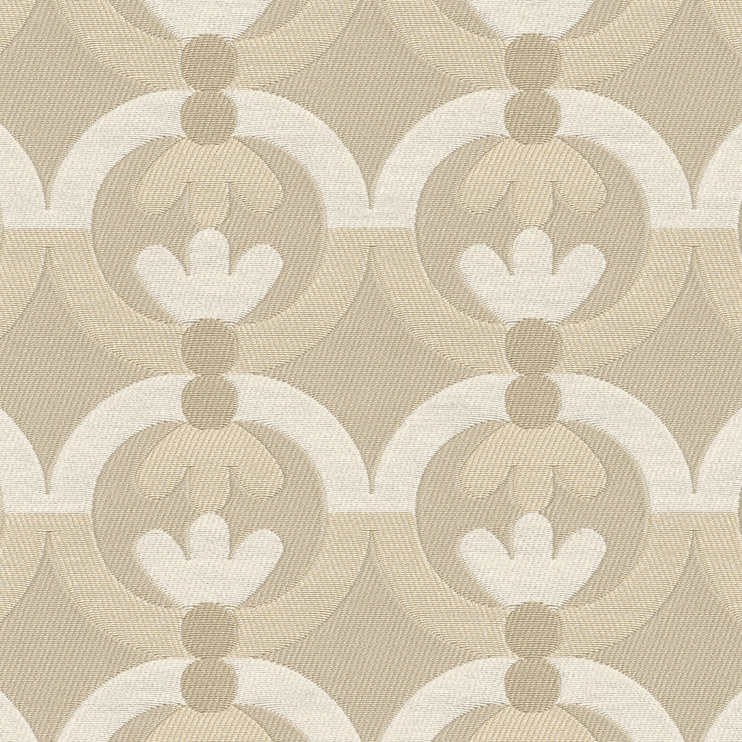
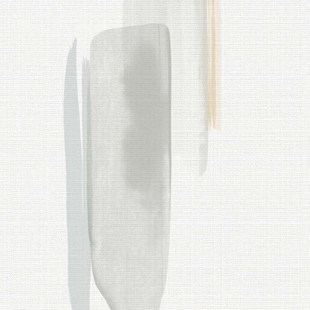
Neutrals provide a versatile backdrop that brings balance and sophistication to any space. These light yet impactful colors are often associated with calmness and timeless elegance, creating environments that feel restorative and at ease.
Whether warm tones like browns and taupes or cooler shades like grays and crisp whites, neutrals can be enriched with natural materials such as responsibly-sourced wood grains or cozy wool textiles. These elements add organic texture and a sense of comfort, making layered neutrals ideal for softening any space from car dealerships to law offices and healthcare waiting areas.
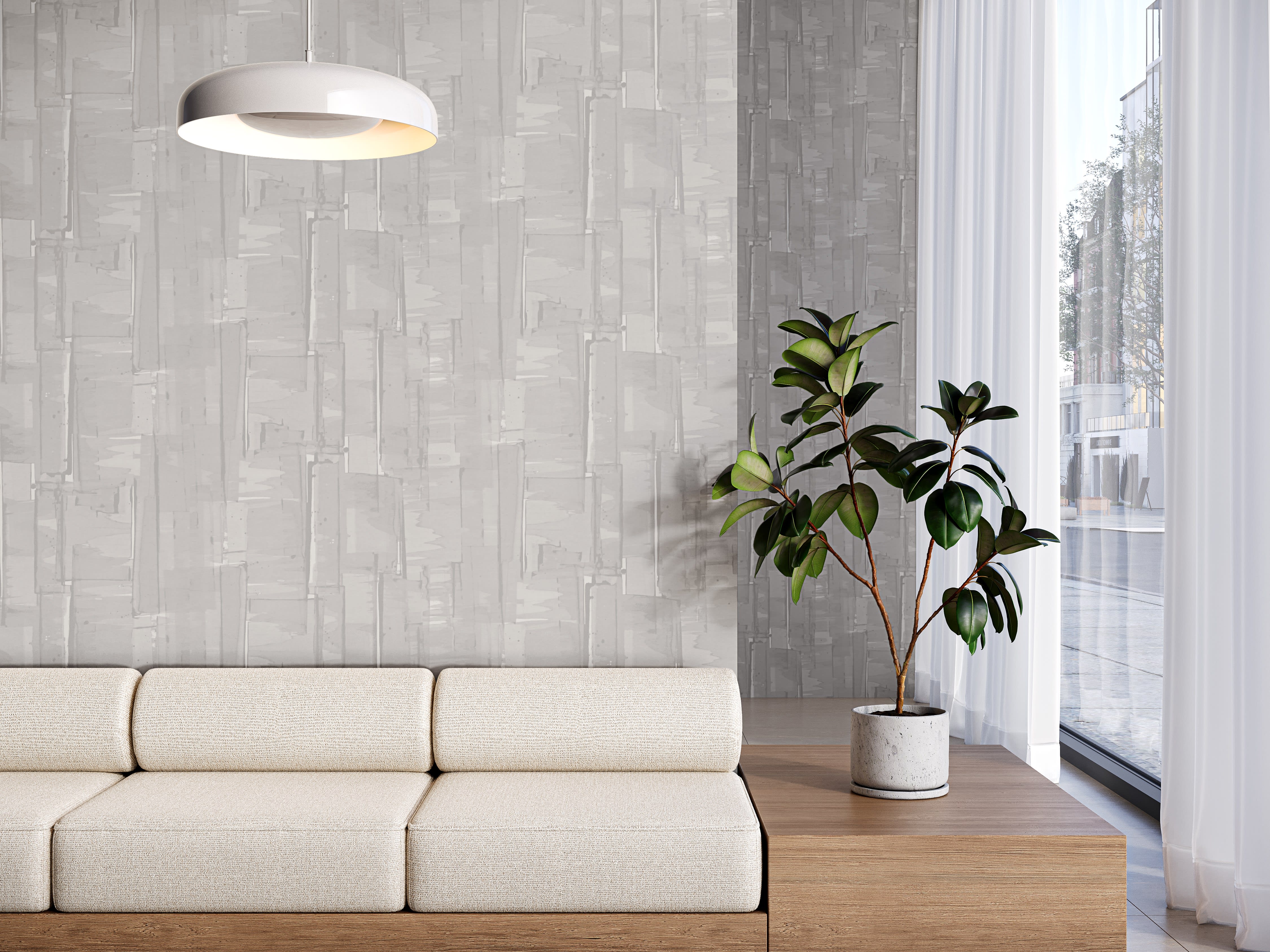
Exclusively at Momentum, the new Symphony Collection products—Simply Sheer (seen above, left) and Sliding Light (right)—showcase how neutrals can make a subtle yet stunning impact. With its artistic transparent effect, Sliding Light adds depth and dimension to any surrounding hue, while lending an effortlessly refined touch to the entire room.
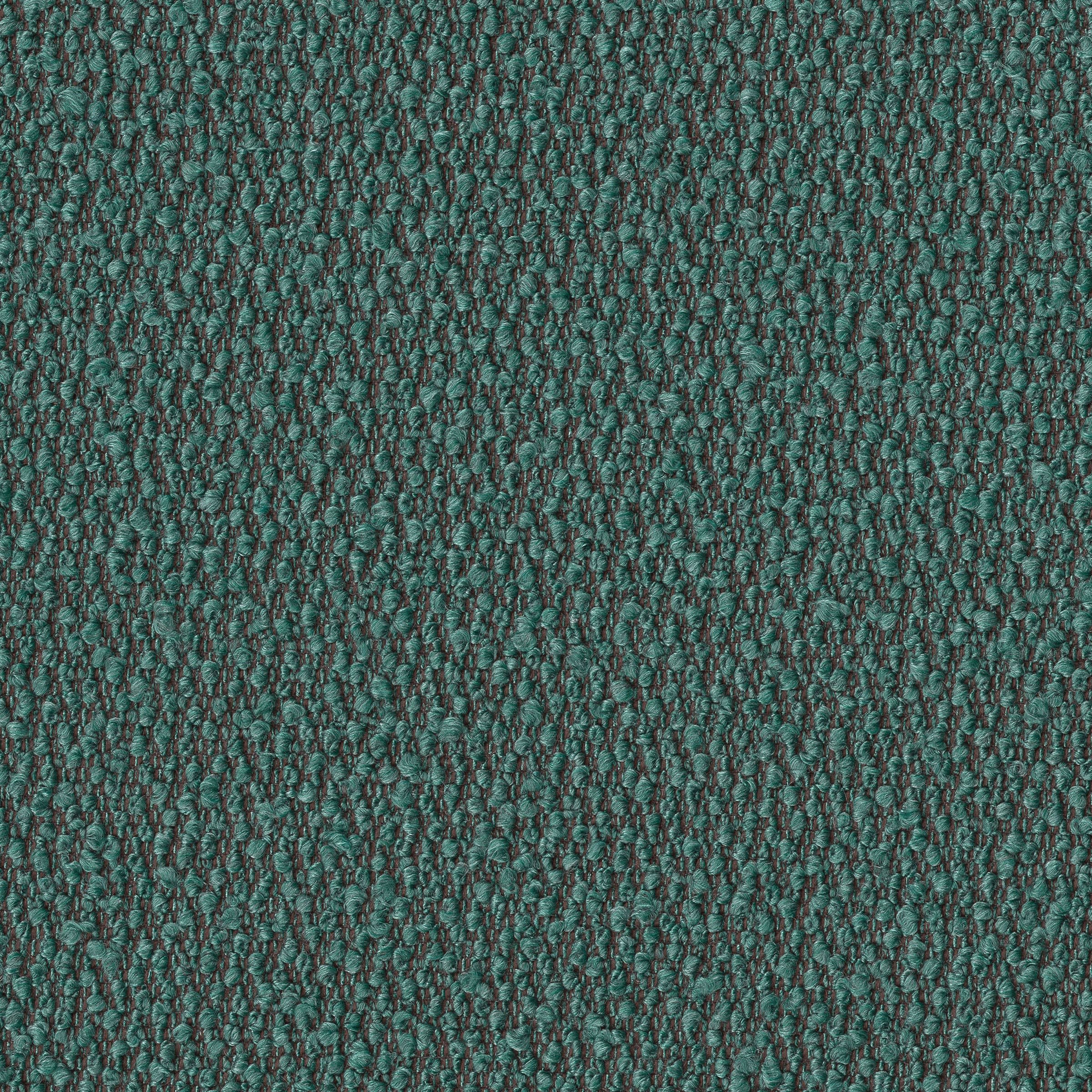
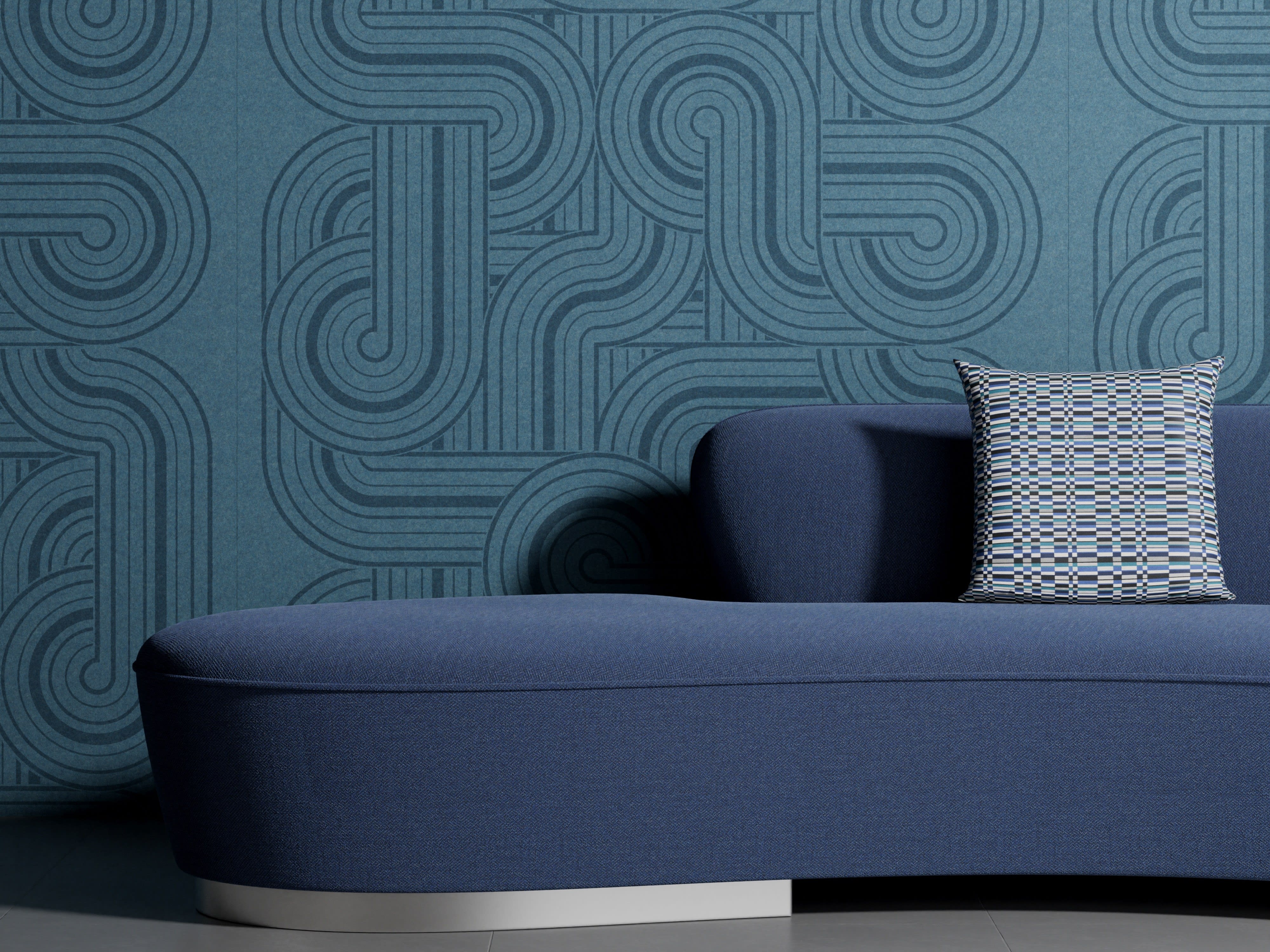
Feel Luxurious: Jewel Tones & Rich Shades
Carousel
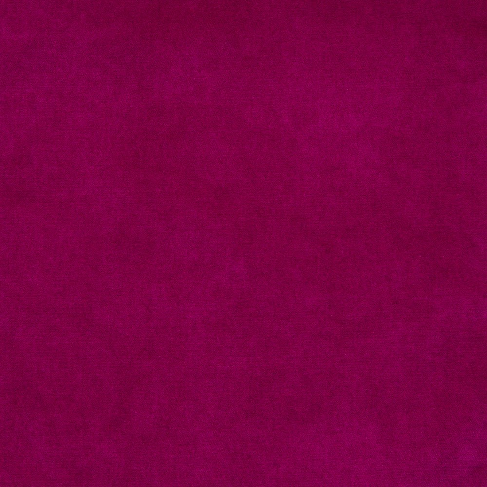
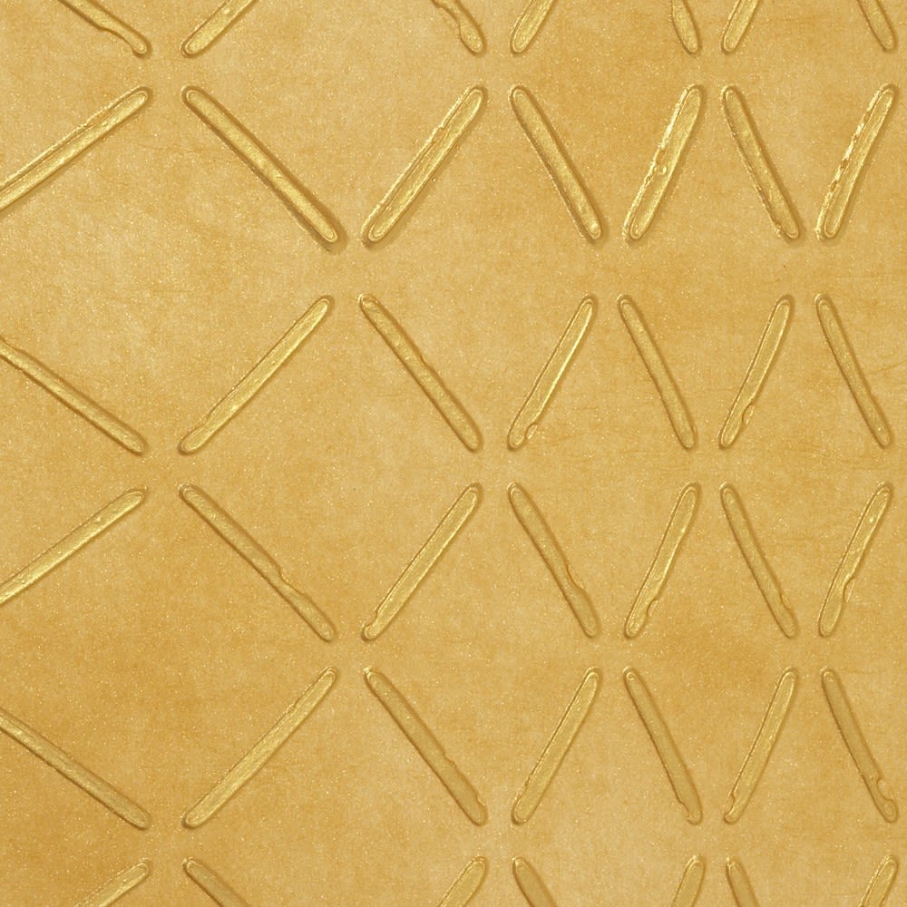
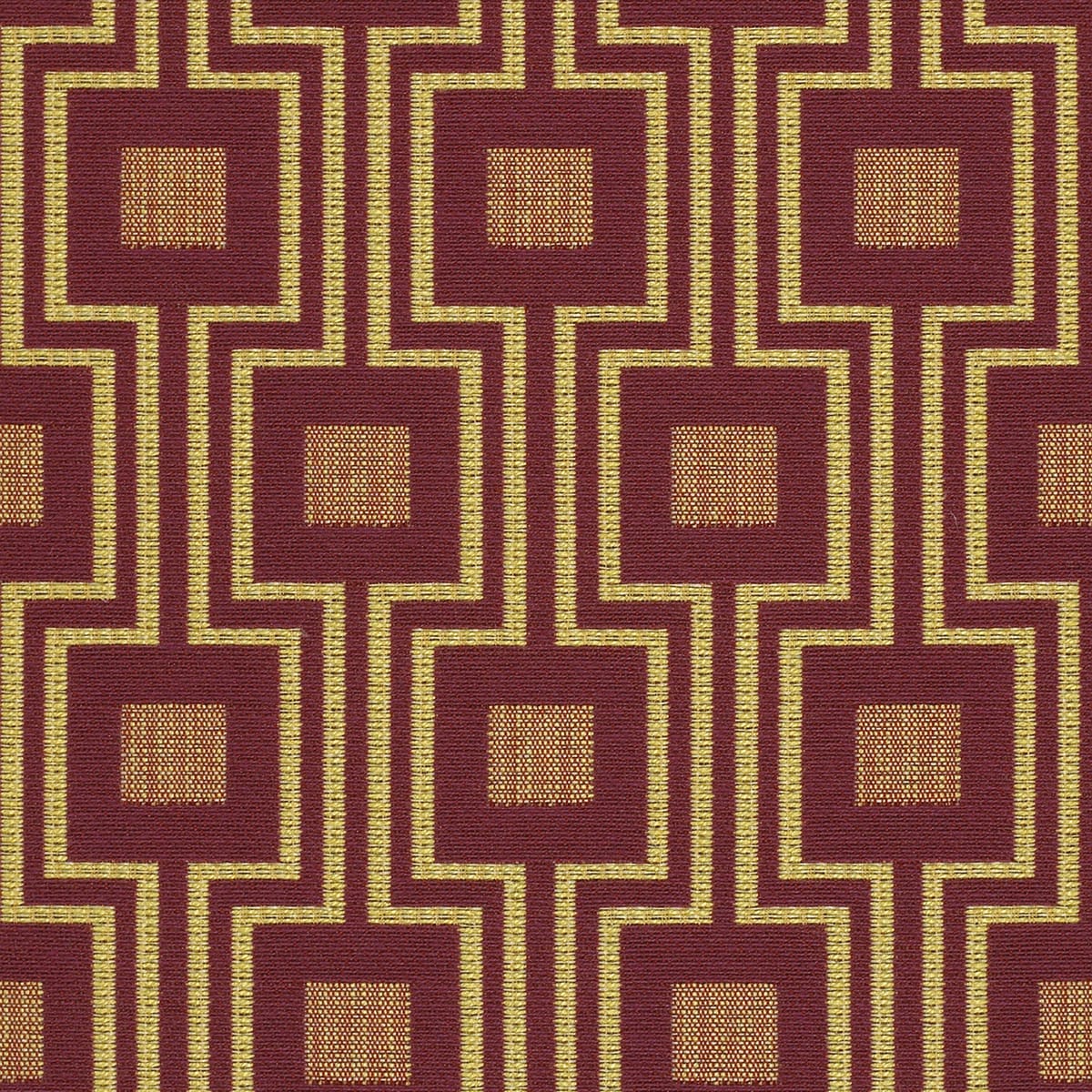
Incorporating rich jewel tones like emerald green, deep purples, and trending blues like Electric Indigo can elevate commercial spaces with a sense of opulence and sophistication. These hues—along with reflective or metallic accents—are recognized in color psychology for evoking feelings of luxury and confidence. When paired with glossy or velvety finishes and refined details, they create a polished, high-end atmosphere that resonates throughout the space, whether on walls, draperies, or pillows.
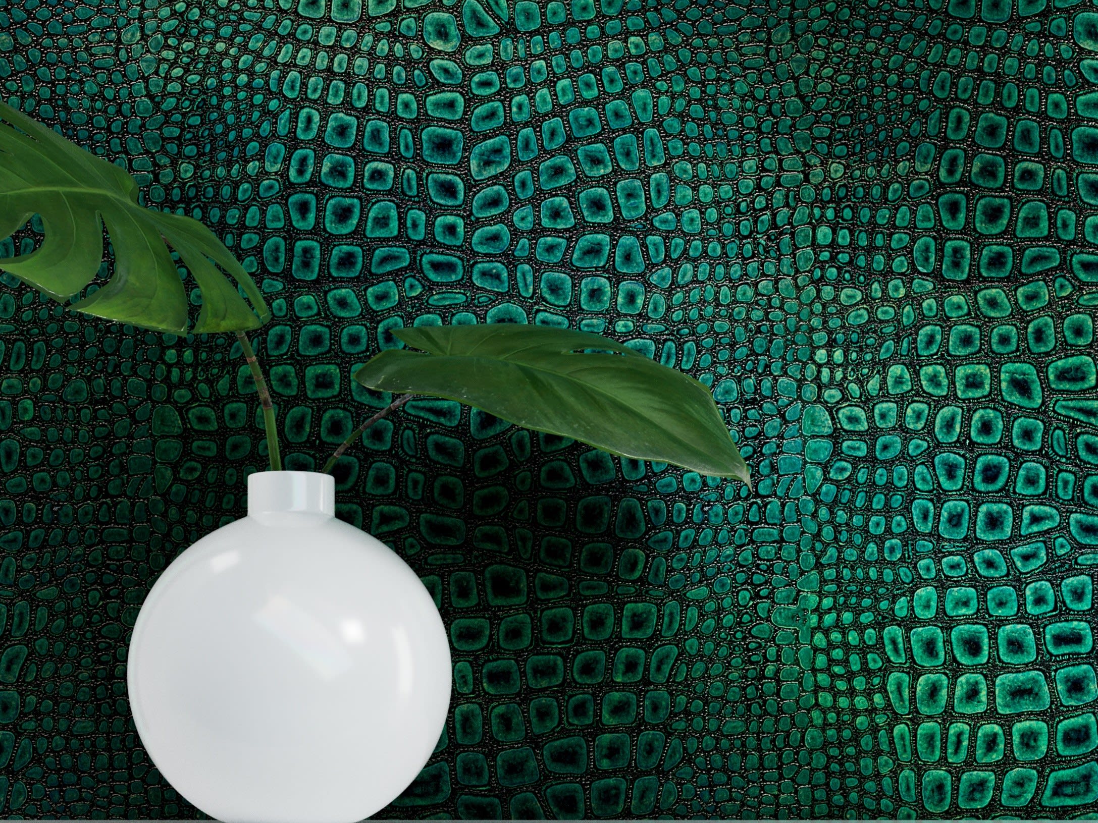
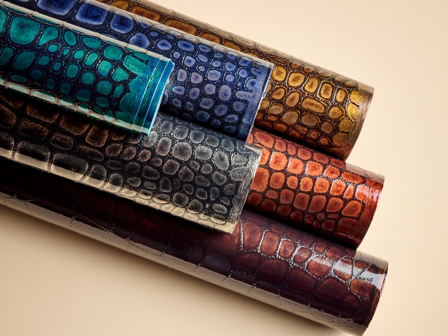
Corso (above) and Corso Lacquer draw inspiration from couture leather goods, featuring croco- and alligator-embossed details with a metallic sheen. Offered in gemstone-inspired colors like Jade Glint (above left), Blue Amber, Copper Glaze, and Black Onyx, these wallcoverings enhance spaces with an inviting, sophisticated ambiance. Corso's textures and vibrant hues bring a distinctive flair that would make any area feel more intimate and exclusive—perfect for retro-glam bars, restaurants, or boutique hotels.
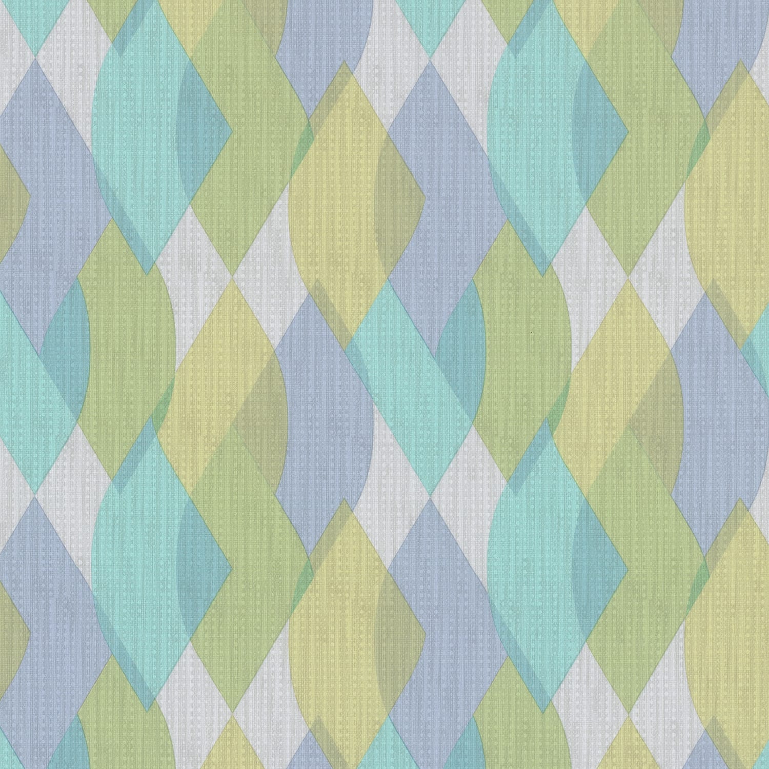
Feel Serene/Sparked: The Spectrum from Barely-There Lights to Hyper-Brights
Carousel
Beyond the color spectrum, it's important to also consider the intensity of colors. When we dial up the saturation, hues become dynamically vibrant and energizing; when lowered, they melt into soft, soothing shades that are irresistibly inviting.
Whether it's soft pastels or bold brights, both ends of the color intensity spectrum are in style—it all comes down to the emotional tone you want to set in a space.
Take the Yinka Ilori patterns, for example: Shifting Motions ranges from the gentle Serene Dream (above, left) to the electrifying neon Reunion colorway (right). The pastel version creates a dreamy, whimsical atmosphere, while the hyper-bright option bursts with energy and cultural vibrancy. From brand-conscious offices to educational spaces, these patterns not only captivate visually but also evoke a strong immediate emotional response, making the environment truly immersive.
When designing commercial spaces, balancing soft hues with darker or brighter shades is key to achieving the desired ambiance. Whether through monochromatic schemes or bold color blocking, there's plenty of room for creativity in incorporating color—whether it's a single shade or a vibrant mix.
The most impactful power of color comes from thoughtful combinations. A standout fabric, wallcovering pattern, or a mix of textures and hues—from warm to cool, light to dark—offers endless creative possibilities. Refreshing a space with pillow pops, reupholstering a chair, or adding a statement wallcovering brings unique personality to any room. The Mix Collage collection (featured at left in several pieces) captures this artful spirit, showing how curated color can transform a space and make every design uniquely personal.
In today's modern era, commercial design takes on a renewed focus, harnessing the power of color to reach new emotional heights—from energizing office environments in splashy rainbow hues to creating inviting restaurant atmospheres with the most refined, gentle pastels. Explore more color psychology tips and color mixing or matching ideas in our showrooms, our social spaces (like our Pinterest "Color of the Month" series), or online at https://momentumtextilesandwalls.com.
Sources
Forbes. “How Color Can Improve Connection and Reinvigorate the Workplace.” https://www.forbes.com/sites/ryananderson/2024/07/01/how-color-can-improve-connection-and-reinvigorate-the-workplace/
Sensational Color. "Color Quotes." https://www.sensationalcolor.com/color-quotes/
Mindful Design Consulting. "The Psychology of Color in Commercial Interior Design." https://mindfuldesignconsulting.com/the-psychology-of-color-in-commercial-interior-design/
WGSN. “Colour Intelligence: The Emotional Power of Colour.” https://www.wgsn.com/fashion/article/87643?lang=en#page_9
WGSN. “NeoCon 2024: Colour, Material & Finish.” https://www.wgsn.com/interiors/article/6672afc7afa0a5989fadc101?lang=en&product=li&reportId=6672afc7afa0a5989fadc101